COSMO
Food Club
Deliverables
Brand Identity, Logo, Guidelines, UI/UX System
Year
2025
Bold geometry meets vibrant flavors — a visual identity capturing the energy and diversity of contemporary street food culture.


The Brief
COSMO Food Club needed an identity that could capture the energy of street food culture while maintaining premium positioning. The challenge: be energetic without being chaotic, diverse without losing coherence.
The Insight
The bold, geometric logotype ensures instant recognition, while the palette blends signature orange with neutrals and vibrant accents. This creates a visual rhythm that reflects the variety of flavors — from ramen to gourmet burgers to artisanal desserts.


The System
Photography and custom illustrations work together to showcase COSMO's wide offer. Dynamic layouts, clear typography, and asymmetric compositions balance energy with clarity — never chaotic, always appetizing.
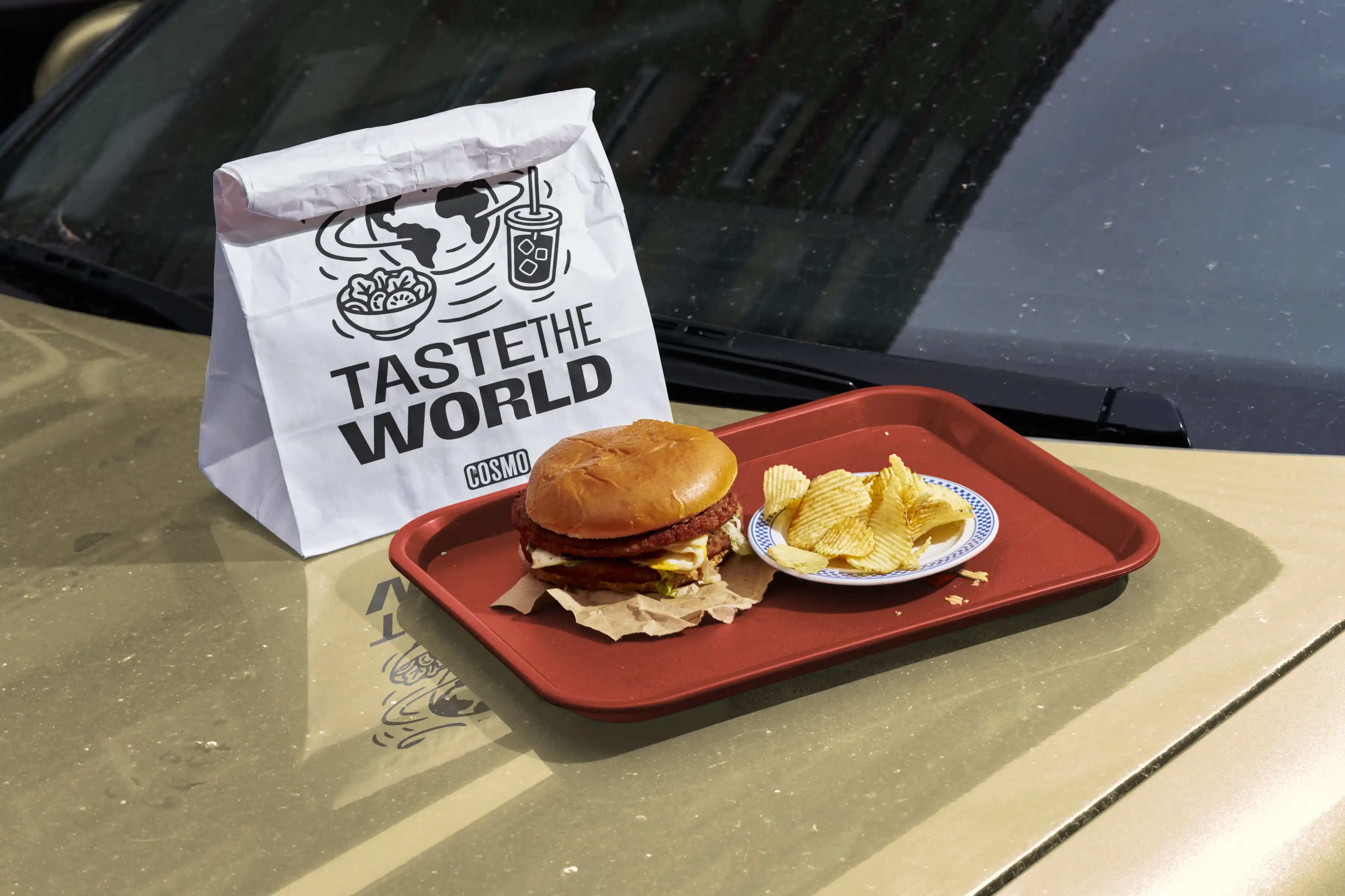
The Detail
The identity system extends from packaging and signage to digital interfaces — menus, app screens, and social content. Every element reinforces the "Taste the World" promise, making COSMO as much a visual experience as it is a culinary one.


The Result
A versatile system built for scale: modular components, consistent brand voice, and visual energy that translates from a paper bag to a storefront to a mobile screen. Street food culture, elevated.


