Solivia
Deliverables
Brand Identity, Art Direction, Packaging & Communication
Year
2025
An art-inspired, unisex clothing brand born to capture the moment where soul meets life.
The Brief
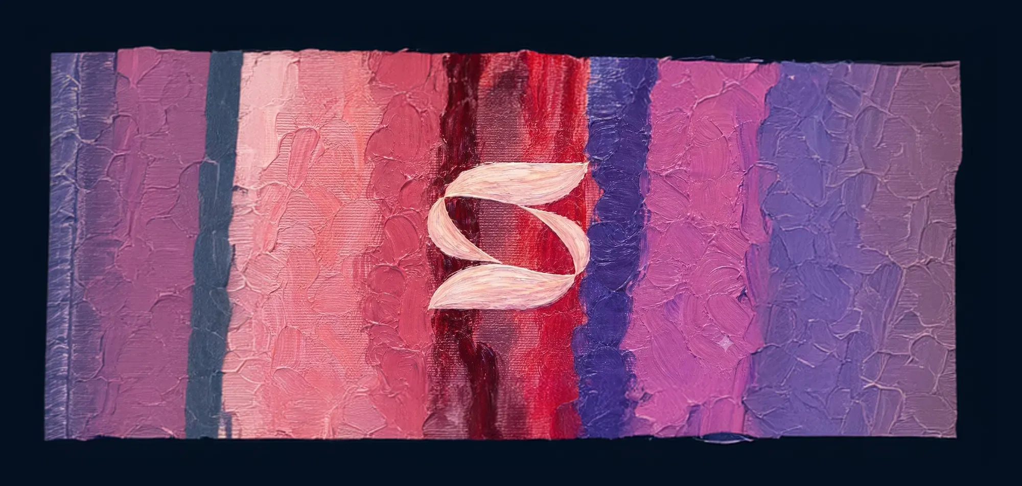
The project began with a painting — a canvas carrying consciousness, emotion and time — and grew into a label that treats art as a structural element of the garment rather than surface decoration. Designed for the rhythms of daily life, such as walking, traveling and transitioning, Solivia needed a voice that felt calm in a market driven by noise, speed and viral trends.
The Insight
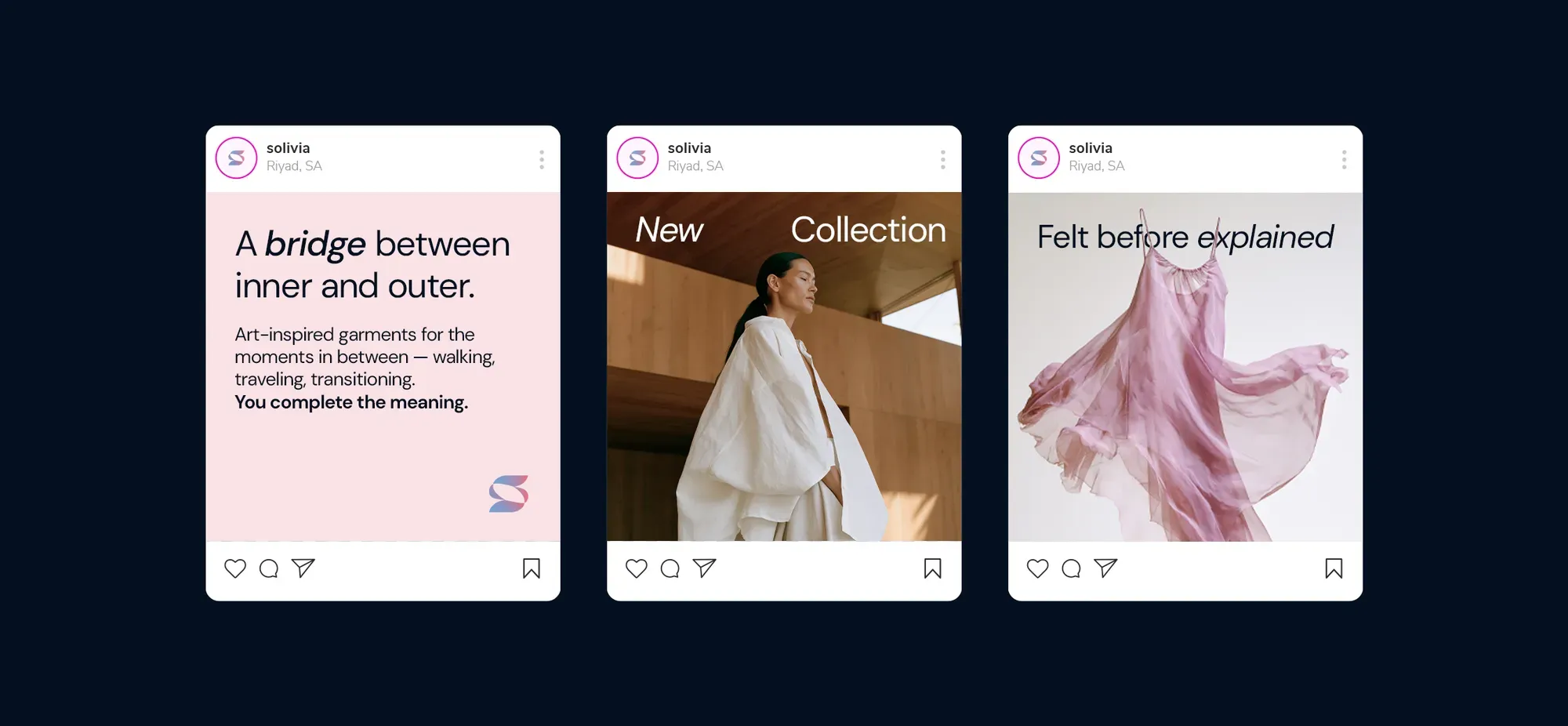
Solivia positions itself as a bridge between inner consciousness and outer reality — a quiet alternative rather than another loud voice. The identity is built on restraint and symbolic depth: presence without volume, a brand designed to be felt before it is explained, and remembered longer than it is seen.
The System
The logomark — two brushstrokes meeting in a single “S” — distills the encounter between soul and life. The palette is drawn directly from the founding painting: serene blue, vivid coral and soft violet, grounded by a clean grayscale system. Typography stays minimal and spacious, letting the wearer complete the meaning.
The Detail
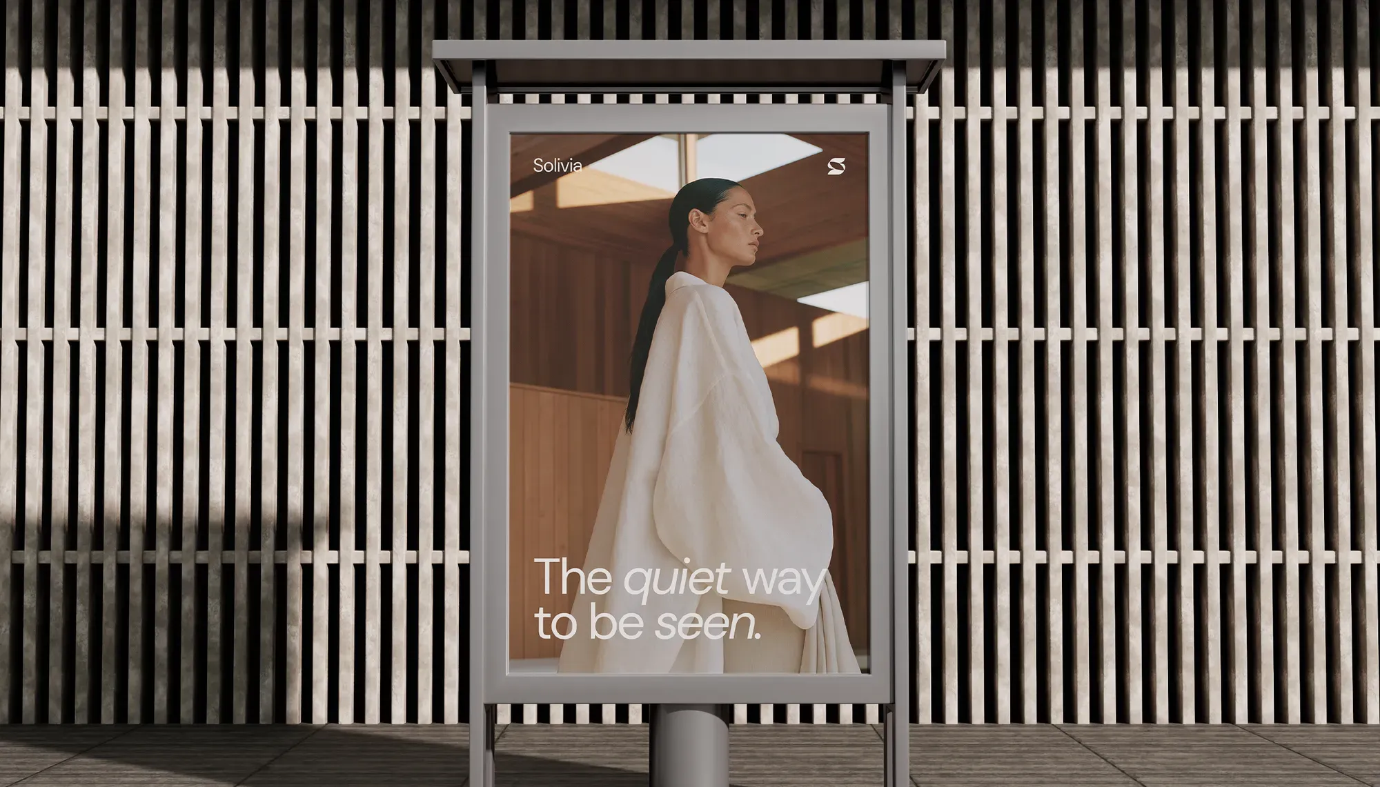
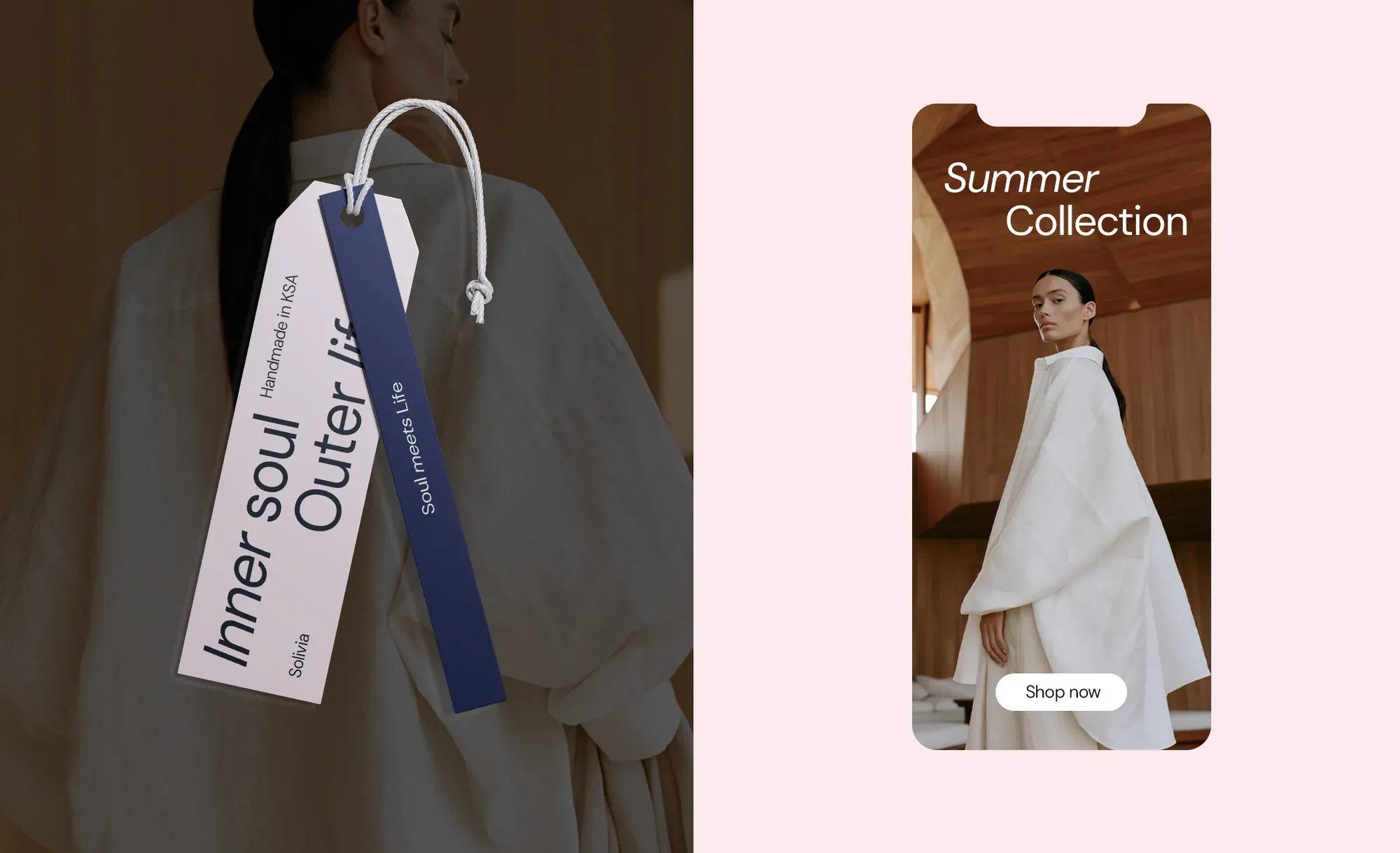
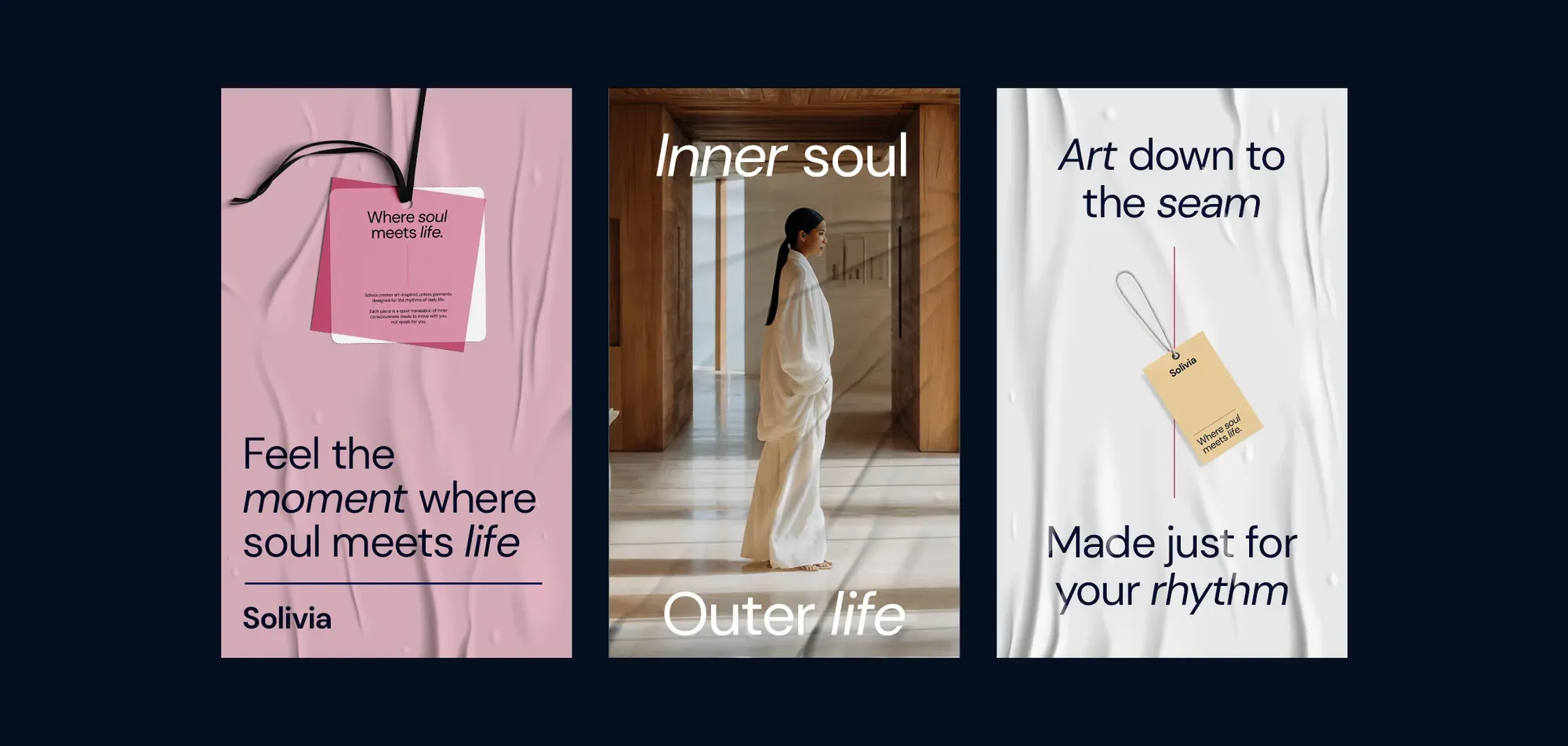
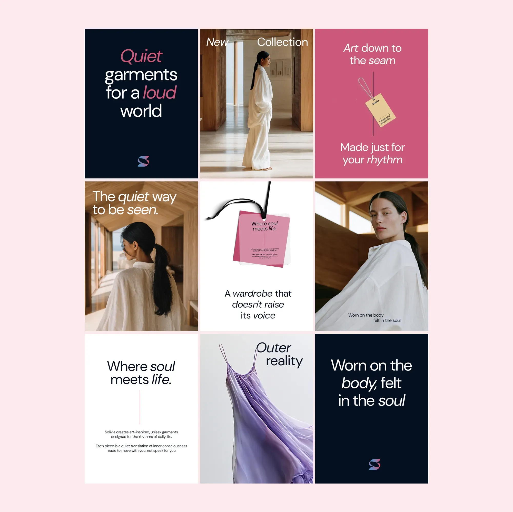
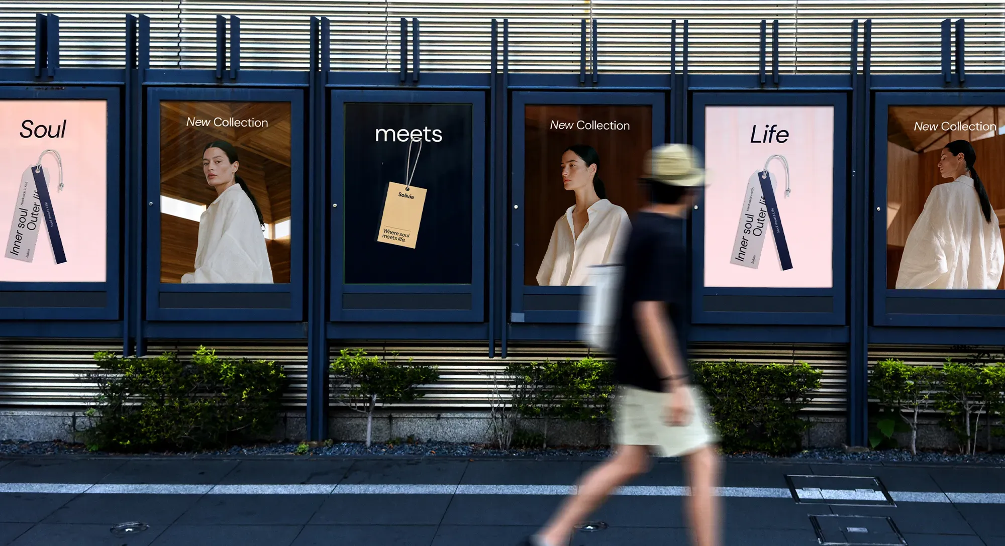
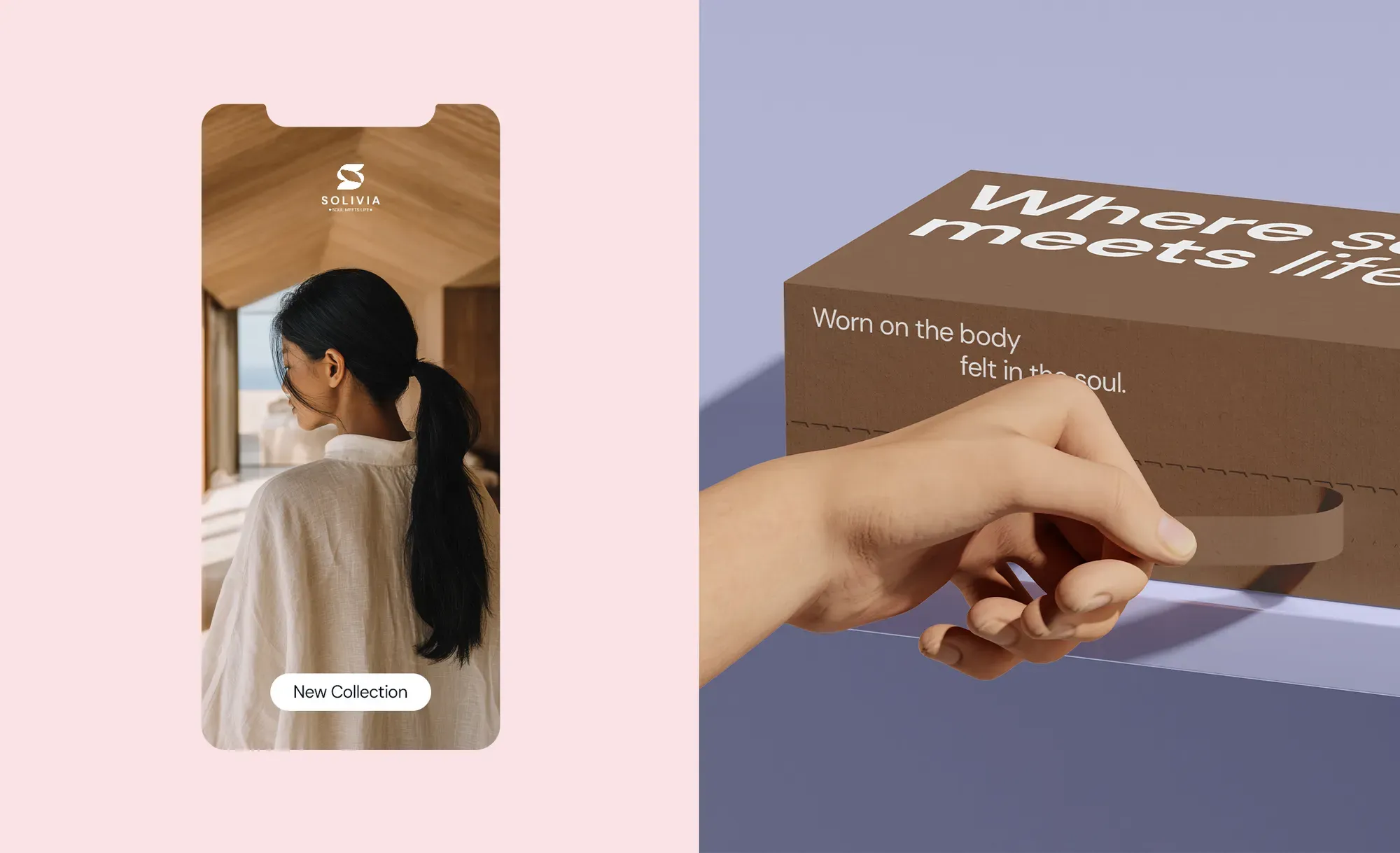
Across labels, packaging and communication, every element follows the same principle. Hang-tags, mailer boxes, campaign posters and social all carry the same restraint — “Inner soul, Outer life”, “Where soul meets life” — treating each touchpoint as a quiet translation of inner consciousness made to move with you, not speak for you.
The Result
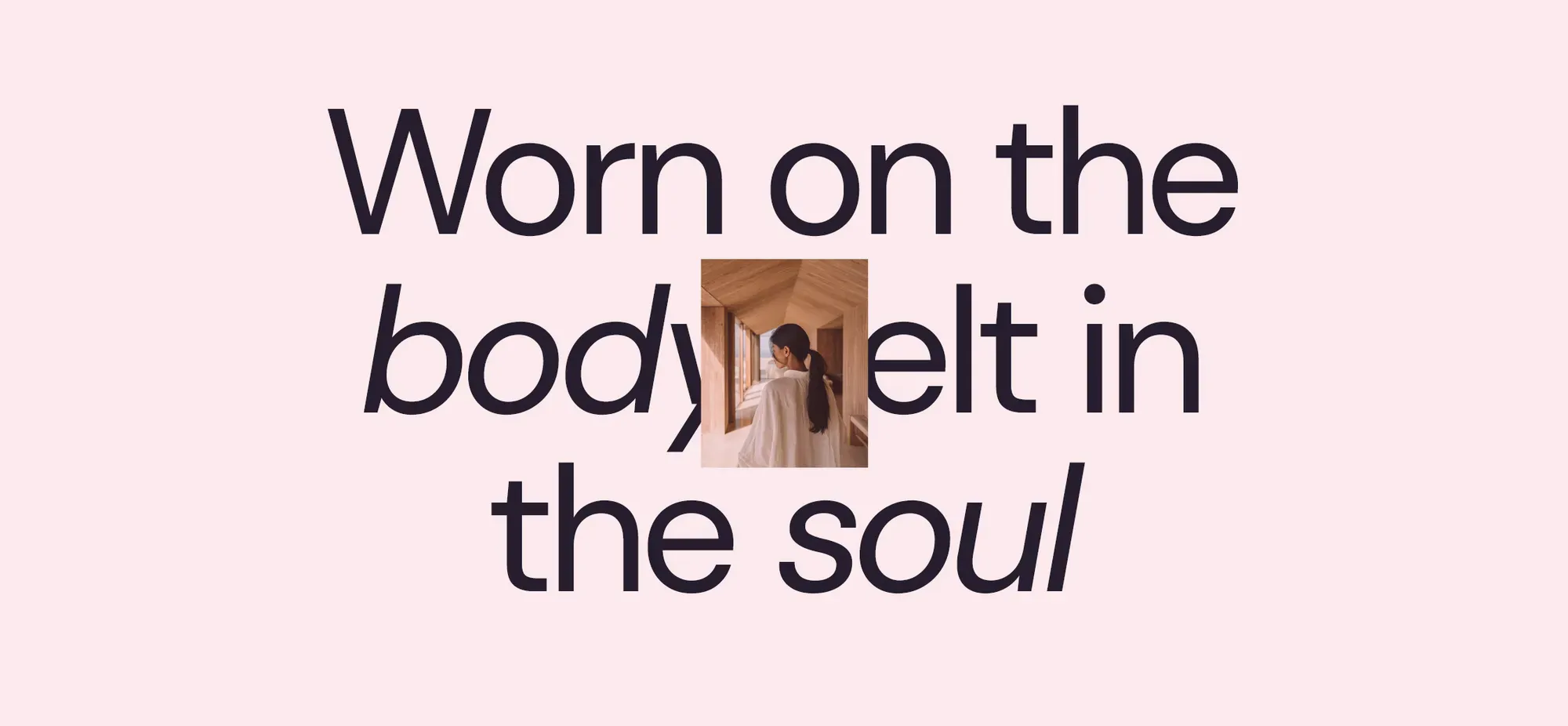
A brand designed to be felt before it is explained. Solivia carries its founding painting through every surface — worn on the body, felt in the soul — a wardrobe that doesn't raise its voice, yet lingers longer than it is seen.